
As a marketing communications agency for B2B technology companies, we pride ourselves on knowing a few things about building optimized landing pages.
We recently ran across a webinar landing page that we thought would help us show how to design — or in this case how NOT to design — a well-optimized landing page. Keep in mind that the purpose of a webinar landing page is simple: convert visitors into registrations as quickly as possible. With such clarity of purpose, it stands to reason that a landing page should be singular in focus, messaging and design.
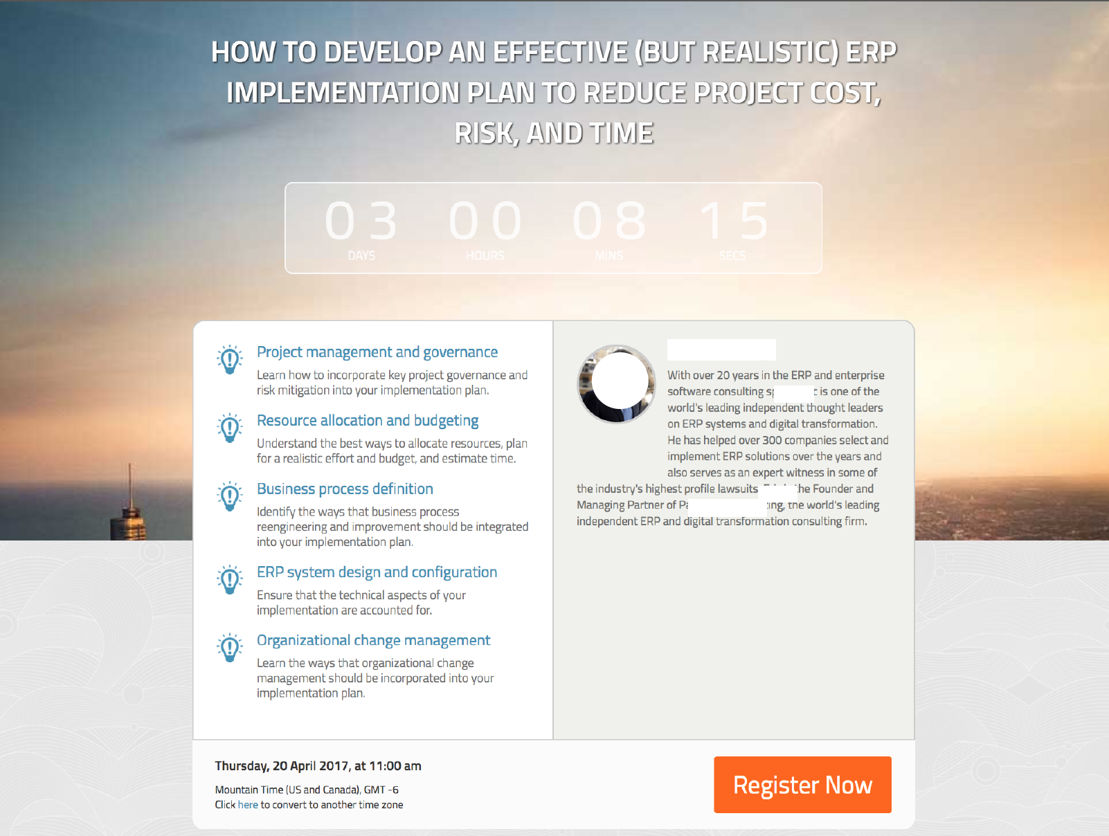
Here is a screenshot of the landing page:
Here is the same screenshot, but marked up with our observations:
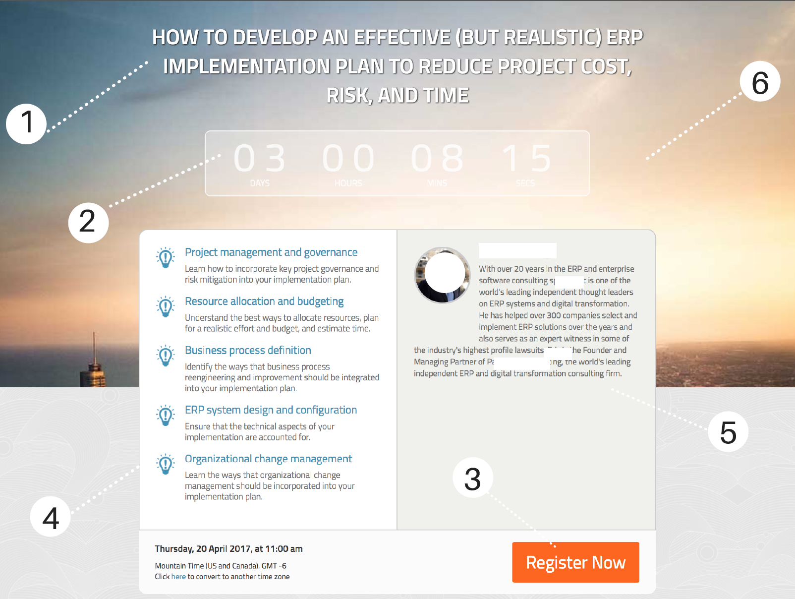
Our main take-aways:
- Title: Shorten it to one line and make it a stronger benefit statement with a high-impact action verb.
- Clock: Ditch it. The effort to create a sense of urgency is lost on most visitors.
- Call-to-action: Move it to the middle where the clock is. The goal is to convert visitors, right?
- Webinar content list: cut it down to main 3 points; you have seconds to make your case, so don’t add too much content. Focus more on benefits, less on feature statements like ‘Business process definition’ as it doesn’t tell us WHY we should attend.
- Bio of presenter: a great opportunity to solidify the value of the webinar by showing the presenter’s bona fides is lost with a muddled layout. Make the picture bigger and put it below the text so that it takes up some of the white space below.
- Design elements: we found the color contrasts weak and made the landing page look bland; a different header picture could have helped by providing sharper contrast to give more attention to the important text messages.